Affiliate Links
I have something of a series now comparing reformulated Wet N Wild products with their predecessors (here and here), among them some of my favorite affordable makeup. Those previously revamped products didn't exactly measure up to the originals in my comparisons, so I have to admit I had serious doubts about the new Wet N Wild Comfort Zone palette. Why change something that has been consistently recommended as one of the best drugstore eyeshadow palettes on the market?
I've been thinking the answer to that question for a while. Unlike many redesigns by other brands, Wet N Wild didn't reduce the product size while jacking up the price. In fact, the price has remained the same, while the weight has actually increased (minimally) from 0.3 to 0.32 oz. Because two new matte shades were added, and they are in the largest pans, that should mean that the size of each of the original shades has decreased, however, which is worth noting.
If I had to guess why the change was made, I'd point to the fragility of the shadows, and maybe the packaging too. I can't be sure, but I do know lots of people complained about their Wet N Wild shadows crumbling and shattering with the slightest bump. I don't know if you can see it in the photo above, but the duochrome in the in bottom right of my old palette does has a small chunk missing--I have no idea when or how that happened. If the eyeshadows broke too often after people bought them, you have to assume that they also frequently broke in transit and while they were in stores, so the amount of product discarded might not have made up for the number of sales. (I'd be curious to hear if anyone's new palette has crumbled, but the shadows seem a bit more durable to me.) Of course, there's also the fact that a new release/re-release generates publicity and increases sales.
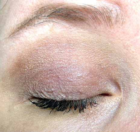
I've had my OG Comfort Zone palette since 2011 or 2012, and despite appearances, I've used it quite a lot. It has intense, smooth, metallic shimmers that perform really well. I'm not such a fan of the matte shades with glitter ("Definer" on the left and "Crease" on the right) though they are decent for lining the eyes. I like it so much that the reformulation had a lot to live up to. I'm not going to do a full review of each palette, but I am going to compare each shade and show you some swatches and eye looks.
Here is the first row of shimmers, in the (new) order of the new palette, starting with the left hand column. All applied over Wet N Wild primer (reviewed here) to make the colors and finishes as clear as possible for comparison. The old version is on the left and the new version is on the right.
Showing posts with label wet n wild. Show all posts
Saturday, June 2, 2018
Tuesday, March 13, 2018
The cheapest metallic thrills: Wet N Wild Silk Finish Lipsticks in Dark Pink Frost and Fuchsia with Blue Pearl
Affiliate Links
Auxiliary Beauty has created a very useful taxonomy flowchart of lipstick finishes, which I think is totally accurate. According to that chart, these two lipsticks are neither metallic, as I'm calling them, nor frosts, as Wet N Wild calls (one of) them. They are probably best classified somewhere in the duochrome or shimmer/pearl families. And yet everything is apparently metallic these days, so I've lazily labelled these things that way too, because I think they serve as cheap dupes or alternatives for the various "metallic" lipsticks that are popping up left and right lately. Whatever you want to call them, they're are good starters for people venturing into reflective lip territory (as well as for those of us who are already pretty comfortable there).
Wet N Wild's Silk Finish Lipsticks are about the cheapest lipsticks you're going to get at 99 cents, and they're really no frills. The packaging is basic (though better designed than the slightly more expensive Wet N Wild MegaLast tubes). Even the names of most of them are simply descriptive. I'm guessing they date back to when these lipsticks were first released, which must be at least 25 years ago, though I haven't been able to find out their history. Even if Dark Pink Frost doesn't seem entirely accurate (it's neither dark nor a frost?), it'll certainly tell you more about what you're getting than the names of the new shades added to the line a few years ago, like What's Up Doc?.
There's definitely some variation in the quality and finish of the lipsticks in this line. I used to have Nouveau Pink, which was a bubblegum pink cream, and it applied and wore wonderfully. In contrast, What's Up Doc? (reviewed here), another cream, was a streaky, slippery mess (but makes a great cream blush!). Both of these shimmers are gorgeous, but Dark Pink Frost is much sheerer than Fuchsia with Blue Pearl. They both have an average wear time--they're not going to last all day, but you're also not going to look in a mirror an hour after applying them to find a mess. Fuchsia with Blue Pearl in particular leaves a pretty even stain behind.
It's a bit difficult to capture the blue in FWBP in a photo, but it's definitely there. And you can see that DPF has some more sparkly shimmer, while FWBP has that smooth pearly finish. But since neither of them reflects back icy or silvery, I don't think they're truly frosty. Each of the swatches below is a few swipes, since, as I said, neither is completely opaque.
So you can see where their subtle duochrome identity comes in. DPF is pink with gold shimmer, or rose gold, and FWBP is, well, fuchsia with blue pearl.
On my lips, DPF does emphasize lines a bit, but that doesn't bother me. Lips normally have lines in them, regardless of age. Think of it the other way around: the texture of my lips enhances the shimmer. It's a warm, rosy pink that keeps it from veering into scarily frosty territory, and it's easy to wear with whatever else I have going on.
FWBP is bolder, for sure, but the blue is subtle enough that if you can pull off a bright pink in general, this isn't going to look costumey or bizarre. It's not perfectly opaque, but it's pigmented enough that you can get good coverage in one layer. Both of these lipsticks are non-drying and maybe even a little moisturizing. Both of the disguise dry flakiness in my lips rather than exaggerating it.
I think these are both, in fact, totally 80s lipsticks while at the same time being totally current. I mean, Too Faced could easily feed us some unicorn-fairy bullshit to sell these colors. Overall, the Wet N Wild Silk Finish lipsticks are decent products with some interesting colors in the line. I think these two stand on their own as just plain good lipsticks, but the $1 price also makes them an excellent choice for trying out colors and finishes you might not be sure will work for you.
I've only tried the four Silk Finish lipsticks mentioned here. Are there any others you've used that you'd recommend?
Auxiliary Beauty has created a very useful taxonomy flowchart of lipstick finishes, which I think is totally accurate. According to that chart, these two lipsticks are neither metallic, as I'm calling them, nor frosts, as Wet N Wild calls (one of) them. They are probably best classified somewhere in the duochrome or shimmer/pearl families. And yet everything is apparently metallic these days, so I've lazily labelled these things that way too, because I think they serve as cheap dupes or alternatives for the various "metallic" lipsticks that are popping up left and right lately. Whatever you want to call them, they're are good starters for people venturing into reflective lip territory (as well as for those of us who are already pretty comfortable there).
Wet N Wild's Silk Finish Lipsticks are about the cheapest lipsticks you're going to get at 99 cents, and they're really no frills. The packaging is basic (though better designed than the slightly more expensive Wet N Wild MegaLast tubes). Even the names of most of them are simply descriptive. I'm guessing they date back to when these lipsticks were first released, which must be at least 25 years ago, though I haven't been able to find out their history. Even if Dark Pink Frost doesn't seem entirely accurate (it's neither dark nor a frost?), it'll certainly tell you more about what you're getting than the names of the new shades added to the line a few years ago, like What's Up Doc?.
There's definitely some variation in the quality and finish of the lipsticks in this line. I used to have Nouveau Pink, which was a bubblegum pink cream, and it applied and wore wonderfully. In contrast, What's Up Doc? (reviewed here), another cream, was a streaky, slippery mess (but makes a great cream blush!). Both of these shimmers are gorgeous, but Dark Pink Frost is much sheerer than Fuchsia with Blue Pearl. They both have an average wear time--they're not going to last all day, but you're also not going to look in a mirror an hour after applying them to find a mess. Fuchsia with Blue Pearl in particular leaves a pretty even stain behind.
It's a bit difficult to capture the blue in FWBP in a photo, but it's definitely there. And you can see that DPF has some more sparkly shimmer, while FWBP has that smooth pearly finish. But since neither of them reflects back icy or silvery, I don't think they're truly frosty. Each of the swatches below is a few swipes, since, as I said, neither is completely opaque.
So you can see where their subtle duochrome identity comes in. DPF is pink with gold shimmer, or rose gold, and FWBP is, well, fuchsia with blue pearl.
On my lips, DPF does emphasize lines a bit, but that doesn't bother me. Lips normally have lines in them, regardless of age. Think of it the other way around: the texture of my lips enhances the shimmer. It's a warm, rosy pink that keeps it from veering into scarily frosty territory, and it's easy to wear with whatever else I have going on.
FWBP is bolder, for sure, but the blue is subtle enough that if you can pull off a bright pink in general, this isn't going to look costumey or bizarre. It's not perfectly opaque, but it's pigmented enough that you can get good coverage in one layer. Both of these lipsticks are non-drying and maybe even a little moisturizing. Both of the disguise dry flakiness in my lips rather than exaggerating it.
I think these are both, in fact, totally 80s lipsticks while at the same time being totally current. I mean, Too Faced could easily feed us some unicorn-fairy bullshit to sell these colors. Overall, the Wet N Wild Silk Finish lipsticks are decent products with some interesting colors in the line. I think these two stand on their own as just plain good lipsticks, but the $1 price also makes them an excellent choice for trying out colors and finishes you might not be sure will work for you.
I've only tried the four Silk Finish lipsticks mentioned here. Are there any others you've used that you'd recommend?
Tuesday, June 27, 2017
Reviews in Fifty Words or Less
Affiliate Links
I got this idea from the wonderful Makeup Withdrawal, and I'm going to give it a shot. It will be a challenge for someone as wordy as I am, but I don't think I have a lot to say about these products, so here we go!
Yves Saint Laurent Touche Eclat Radiance Perfecting Pen in Luminous Ivory
Maybelline The Falsies Volum'Express Mascara
Decent volume and length without clumping. The curved brush and length of the bristles work well.
I've been liking this better in month two as it gets drier. Too much flaking for me to repurchase, though.
Wet N Wild Mattifying Powder
Got this in a Sephora Play! box. Not really pink--I'd call it peachy-beige. It's a nice, all-over-the-lid eyeshadow, and it lasts better than any other cream eyeshadow I've used, even without primer. Could make a good highlighter, too.
Swatched:
Blended out:
It's ok. I bought it for double cleansing, but it's a little drying, so I only use it combined with gentle micellar water. It removes most of my makeup. The generic fruity-floral scent is a bit strong--and I always end up tasting it after I've rinsed my face. Blech.
Success! Of course, if you have questions about any of these products, I'd be happy to fill in the blanks. I'm also interested to hear your experiences with them, or recommendations for alternatives, as always.
I got this idea from the wonderful Makeup Withdrawal, and I'm going to give it a shot. It will be a challenge for someone as wordy as I am, but I don't think I have a lot to say about these products, so here we go!
Yves Saint Laurent Touche Eclat Radiance Perfecting Pen in Luminous Ivory
Sheer, slightly luminous concealer that I use on lazy days. Makes
me look less dead but doesn’t cover my dark circles completely. Faint lavender fragrance.
Came from a Sephora Favorites set, but I wouldn’t buy it at full price. Lots of
cheap equivalents work exactly the same way.
Maybelline The Falsies Volum'Express Mascara
Decent volume and length without clumping. The curved brush and length of the bristles work well.
I've been liking this better in month two as it gets drier. Too much flaking for me to repurchase, though.
Wet N Wild Mattifying Powder
Does the job: mattifies, invisible on my skin, fine texture. The main problem is that it contains very little product. I've used it only a couple dozen times.
It looks thick because there’s a sponge in the bottom
compartment, but the pan is shallow.
For less than $5 you can get more product from Essence.
Got this in a Sephora Play! box. Not really pink--I'd call it peachy-beige. It's a nice, all-over-the-lid eyeshadow, and it lasts better than any other cream eyeshadow I've used, even without primer. Could make a good highlighter, too.
Swatched:
Blended out:
It's ok. I bought it for double cleansing, but it's a little drying, so I only use it combined with gentle micellar water. It removes most of my makeup. The generic fruity-floral scent is a bit strong--and I always end up tasting it after I've rinsed my face. Blech.
Success! Of course, if you have questions about any of these products, I'd be happy to fill in the blanks. I'm also interested to hear your experiences with them, or recommendations for alternatives, as always.
Friday, December 9, 2016
Do I Need This? Mascara Primer (Wet N Wild PhotoFocus Lash Primer vs. Lancôme Cils Booster XL Mascara Base vs. Benefit They're Real Tinted Lash Primer)
Affiliate Links
Welcome to the latest installment of my Do I Need This? series. In these posts, I offer my experience and opinions about whether or not I think a product or technique is worth it. Obviously, you don't really need ANY beauty products, so the answer to the question is always going to be no, to some extent. But is it going to change your life (or face)? Is it going to make things easier? Are you going to notice any difference at all? That's what I'm getting at. You may disagree with my verdict, because we all have different bodies/faces/brains/desires, but I'll try to offer a starting point, at least.
I wrote a while ago about how it seems like we're supposed to "prime" our whole bodies these days, and it's getting a bit ridiculous. Nevertheless, eyeshadow primer kind of changed my life. Or at least how I wear eyeshadow. Mascara primer is another one that's been around for ages, at least in more expensive brands, but it's popping up more at the drugstore now as our need to prime proliferates. Over the years I've got countless mini tubes of mascara primer from brands like Dior and Lancôme as various gifts-with-purchase, and I've used them, but I was never really sure that they did much. So I figured I'd do a quasi-scientific test of a few lash primers to see if they actually make difference.
Do you need mascara primer?
Short answer: No, just use an extra coat of mascara.
Welcome to the latest installment of my Do I Need This? series. In these posts, I offer my experience and opinions about whether or not I think a product or technique is worth it. Obviously, you don't really need ANY beauty products, so the answer to the question is always going to be no, to some extent. But is it going to change your life (or face)? Is it going to make things easier? Are you going to notice any difference at all? That's what I'm getting at. You may disagree with my verdict, because we all have different bodies/faces/brains/desires, but I'll try to offer a starting point, at least.
I wrote a while ago about how it seems like we're supposed to "prime" our whole bodies these days, and it's getting a bit ridiculous. Nevertheless, eyeshadow primer kind of changed my life. Or at least how I wear eyeshadow. Mascara primer is another one that's been around for ages, at least in more expensive brands, but it's popping up more at the drugstore now as our need to prime proliferates. Over the years I've got countless mini tubes of mascara primer from brands like Dior and Lancôme as various gifts-with-purchase, and I've used them, but I was never really sure that they did much. So I figured I'd do a quasi-scientific test of a few lash primers to see if they actually make difference.
Do you need mascara primer?
Short answer: No, just use an extra coat of mascara.
Saturday, October 22, 2016
Giveaway: Wet N Wild Plaid to the Bone limited edition eyeshadow trio
I spotted a full fall limited edition Wet N Wild display at my nearest CVS recently, and since I knew there were people who had been looking for this Plaid to the Bone trio without any luck, I decided to pick up another one and do a giveaway. Obviously this isn't a high value prize, but it's a fun one. You can see my swatches of the trio here.
Giveaway details:
Prize is one (1) Wet N Wild ColorIcon Eyeshadow Trio in Plaid to the Bone. Giveaway open internationally. Winner will be chosen at random using the Rafflecopter widget. Winner must provide mailing address within 48 hours of announcing the winner. If I don't receive that information, I will choose a new winner. Only the first entry option is required to enter the giveaway. All other tasks are optional and will generate additional entries.
Ends October 31, 2016.
a Rafflecopter giveaway
Monday, October 10, 2016
Good fortune: Wet N Wild Limited Edition Color Icon Trio in Plain to the Bone
Disclosure: Affiliate links.
You know when you see an acquaintance coming toward you across the street, so you cross to the other side of the intersection to avoid an awkward stop-and-chat? But then you realize they're crossing too and you're forced into small talk that neither of you particularly wants to engage in anyway? Just me? Well, anyway, there was a CVS on that side of the street. so I ended up wandering in, and found one lone Wet N Wild Color Icon trio in the fall display, and it was the one I wanted: Plaid to the Bone. The universe was in balance again.
I don't know how likely it is that you will be able to find these eyeshadows in your local drugstore. I think they only appeared in my CVS 1-2 weeks ago, but like I said, the display was almost picked clean. I hope you do find them, though, because they are perfect and beautiful and you know I don't often gush about things. Either way, gaze on the duochrome beauty here and be in awe.
Unlike some of the weird combinations of shadows Wet N Wild sometimes comes up with, these are really well coordinated. The duochrome is basically a combination of the other two shades, which is a cool idea. I wouldn't wear them on the places they suggest you wear them (the "Browbone" shade is too dark for that part of my eyelid), but I think it would be possible to create a look using all three together. So far I have worn the duochrome on my mobile lid and the brown in the crease, and I wore the navy/teal as a liner with a matte brown shadow.
Swatches:
These swatches were done with a brush, not over primer. The teal took a little extra work to build up, but they're all very nicely pigmented, and they work wonderfully over primer. It's interesting that in sunlight, the middle dark teal shade, which looks like a completely matte navy blue in the pan, actually has a slight sheen to it. It does look pretty much matte on my eyelids though.
Here are a couple of comparisons (again on bare skin with a brush). The duochrome from the Wet N Wild Comfort Zone palette has a similar teal shimmer, but a much redder base. The Plaid to the Bone duochrome is a neutral brown base, and the shimmer might be slightly greener. The Comfort Zone shadow is a little softer and more intense.
I also compared the teal shade to Makeup Geek's Time Travel (reviewed here). It's so interesting to me that Time Travel looks teal in the pan, but often looks navy when you use/swatch it, and the Plaid to the Bone shadow looks navy in the pan and teal when you use/swatch it. I like the Plaid to the Bone teal better.
I haven't had time to take photos of these on my eyes, but I thought I might as well post swatches and review details sooner rather than later, since this won't be around for long. I'm not usually someone who goes after "limited edition" shit, and I wouldn't have made a special effort to hunt this down, but I'm very pleased that I happened upon it. It really is great. I think Wet N Wild should seriously consider making it permanent. It's much more interesting and useable than some of their other Color Icon Trios.
If you really want it and can't find it in a store, some intrepidentrepreneurs resellers gougers have snatched some of these up and are selling them for $8+ on Ebay and Amazon. Otherwise, happy hunting! An excellent duochrome for under $4 is truly a blessing unto all who find it.
You know when you see an acquaintance coming toward you across the street, so you cross to the other side of the intersection to avoid an awkward stop-and-chat? But then you realize they're crossing too and you're forced into small talk that neither of you particularly wants to engage in anyway? Just me? Well, anyway, there was a CVS on that side of the street. so I ended up wandering in, and found one lone Wet N Wild Color Icon trio in the fall display, and it was the one I wanted: Plaid to the Bone. The universe was in balance again.
I don't know how likely it is that you will be able to find these eyeshadows in your local drugstore. I think they only appeared in my CVS 1-2 weeks ago, but like I said, the display was almost picked clean. I hope you do find them, though, because they are perfect and beautiful and you know I don't often gush about things. Either way, gaze on the duochrome beauty here and be in awe.
Unlike some of the weird combinations of shadows Wet N Wild sometimes comes up with, these are really well coordinated. The duochrome is basically a combination of the other two shades, which is a cool idea. I wouldn't wear them on the places they suggest you wear them (the "Browbone" shade is too dark for that part of my eyelid), but I think it would be possible to create a look using all three together. So far I have worn the duochrome on my mobile lid and the brown in the crease, and I wore the navy/teal as a liner with a matte brown shadow.
Swatches:
Here are a couple of comparisons (again on bare skin with a brush). The duochrome from the Wet N Wild Comfort Zone palette has a similar teal shimmer, but a much redder base. The Plaid to the Bone duochrome is a neutral brown base, and the shimmer might be slightly greener. The Comfort Zone shadow is a little softer and more intense.
I also compared the teal shade to Makeup Geek's Time Travel (reviewed here). It's so interesting to me that Time Travel looks teal in the pan, but often looks navy when you use/swatch it, and the Plaid to the Bone shadow looks navy in the pan and teal when you use/swatch it. I like the Plaid to the Bone teal better.
| Swatches in indirect light: Wet N Wild Comfort Zone duochrome, Wet N Wild Plaid to the Bone duochrome, Makeup Geek Time Travel and Wet N Wild Plaid to the Bone. |
| Swatches in direct sunlight: Wet N Wild Comfort Zone duochrome, Wet N Wild Plaid to the Bone duochrome, Makeup Geek Time Travel and Wet N Wild Plaid to the Bone |
If you really want it and can't find it in a store, some intrepid
Monday, September 26, 2016
New Wet N Wild Primer PhotoFocus Eyeshadow Primer vs. (discontinued) Wet N Wild Fergie Eyeshadow Primer
Disclosure: Affiliate links.
Wet N Wild repackaged and reformulated a few of their products recently when they discontinued their Fergie line. I compared the new and old Pearlescent Pink blushes not long ago (not the same!), and I bought a tube of the new eyeshadow primer at the same time to do a similar comparison.
The Fergie primer was my favorite for years. I compared it to a a bunch of other primers (here and here), and for the price, it really couldn't be beat. So I was horrified to hear that it had been discontinued and disappointed when I read comments from some people who said that its replacement, PhotoFocus Eyeshadow Primer, wasn't quite the same. I was curious to find out for myself, especially since the ingredients list for the Fergie primer and the new PhotoFocus primer are identical. (You can see the new ingredients here and the old ones here.) How could it be different, then? In fact, Wet N Wild says "new look" on the product page for this primer--not "new product."
But I can confirm that the new and old primers do not seem to be the same. I don't know what that means. Different suppliers for the ingredients? Different factory/manufacturing process? Who knows!
The new primer has a decidedly thicker and firmer texture and it doesn't intensify eyeshadow quite as well as the old primer. Take a look:
I used a mediocre CoverGirl eyeshadow single to test the primer. On the far left is no primer, then PhotoFocus, then Fergie, and finally Black Radiance (reviewed here) for good measure, since it's made by the same company. It was harder to build up the intensity of the eyeshadow over the PhotoFocus primer--better than no primer at all, but not nearly as effective as the other two. The new primer also seemed to be slightly different in color/opacity from the Fergie stuff, in addition to being much thicker. You can see the difference faintly at the bottom of each of the swatches above, but I swatched all three on white paper to show it more clearly.
Again, PhotoFocus on the left, Fergie in the middle, and Black Radiance on the right. It's not the easiest photo to interpret, so let me help. The Fergie primer is the most opaque of the three and also the most yellow-toned. The PhotoFocus primer is sheerer, but not as sheer as the Black Radiance primer. None of these three products is identical.
Of course, I've also used the new primer on my actual eyelids. In the test pictured here, I used PhotoFocus on one eye and Fergie on the other, under Burberry Rosewood. I find Rosewood (swatched here) to be quite powdery and sheer, so it benefits from a good primer.
PhotoFocus, immediately after application:
Fergie, immediately after application:
I didn't see much difference, other than that my right eyelid is apparently more wrinkly. (I think it's mainly the raking angle of the light.)
And then I took photos again at the end of a very sweaty day, after about 8 hours of wear. You'll have to excuse the poorer lighting, since it was night and I had to take the after photos indoors.
PhotoFocus after 8 hours:
Some definite fading, but no creasing.
Fergie after 8 hours:
No creasing here either, but it has faded less.
Conclusions? I don't know exactly what the fuck Wet N Wild is doing with these replacements for products that were formerly well-loved and highly rated, which are ostensibly the same thing, but clearly aren't really. If your primary reason for using an eyeshadow primer is to prevent creasing, you should be fine using the new PhotoFocus primer (I have extremely oily eyelids, so I've put them to a rigorous test). If, however, you mainly want to intensify the pigmentation or opacity of your eyeshadow or to prevent fading, I would opt for something else, like the Black Radiance primer. Though it looks and feels more like the PhotoFocus primer than the Fergie one, the Black Radiance primer performs better. And it's cheap, too. Or you can stock up on leftover tubes of Fergie primer while you still can.
Wet N Wild repackaged and reformulated a few of their products recently when they discontinued their Fergie line. I compared the new and old Pearlescent Pink blushes not long ago (not the same!), and I bought a tube of the new eyeshadow primer at the same time to do a similar comparison.
The Fergie primer was my favorite for years. I compared it to a a bunch of other primers (here and here), and for the price, it really couldn't be beat. So I was horrified to hear that it had been discontinued and disappointed when I read comments from some people who said that its replacement, PhotoFocus Eyeshadow Primer, wasn't quite the same. I was curious to find out for myself, especially since the ingredients list for the Fergie primer and the new PhotoFocus primer are identical. (You can see the new ingredients here and the old ones here.) How could it be different, then? In fact, Wet N Wild says "new look" on the product page for this primer--not "new product."
But I can confirm that the new and old primers do not seem to be the same. I don't know what that means. Different suppliers for the ingredients? Different factory/manufacturing process? Who knows!
The new primer has a decidedly thicker and firmer texture and it doesn't intensify eyeshadow quite as well as the old primer. Take a look:
I used a mediocre CoverGirl eyeshadow single to test the primer. On the far left is no primer, then PhotoFocus, then Fergie, and finally Black Radiance (reviewed here) for good measure, since it's made by the same company. It was harder to build up the intensity of the eyeshadow over the PhotoFocus primer--better than no primer at all, but not nearly as effective as the other two. The new primer also seemed to be slightly different in color/opacity from the Fergie stuff, in addition to being much thicker. You can see the difference faintly at the bottom of each of the swatches above, but I swatched all three on white paper to show it more clearly.
Again, PhotoFocus on the left, Fergie in the middle, and Black Radiance on the right. It's not the easiest photo to interpret, so let me help. The Fergie primer is the most opaque of the three and also the most yellow-toned. The PhotoFocus primer is sheerer, but not as sheer as the Black Radiance primer. None of these three products is identical.
Of course, I've also used the new primer on my actual eyelids. In the test pictured here, I used PhotoFocus on one eye and Fergie on the other, under Burberry Rosewood. I find Rosewood (swatched here) to be quite powdery and sheer, so it benefits from a good primer.
PhotoFocus, immediately after application:
I didn't see much difference, other than that my right eyelid is apparently more wrinkly. (I think it's mainly the raking angle of the light.)
And then I took photos again at the end of a very sweaty day, after about 8 hours of wear. You'll have to excuse the poorer lighting, since it was night and I had to take the after photos indoors.
PhotoFocus after 8 hours:
Some definite fading, but no creasing.
Fergie after 8 hours:
No creasing here either, but it has faded less.
Conclusions? I don't know exactly what the fuck Wet N Wild is doing with these replacements for products that were formerly well-loved and highly rated, which are ostensibly the same thing, but clearly aren't really. If your primary reason for using an eyeshadow primer is to prevent creasing, you should be fine using the new PhotoFocus primer (I have extremely oily eyelids, so I've put them to a rigorous test). If, however, you mainly want to intensify the pigmentation or opacity of your eyeshadow or to prevent fading, I would opt for something else, like the Black Radiance primer. Though it looks and feels more like the PhotoFocus primer than the Fergie one, the Black Radiance primer performs better. And it's cheap, too. Or you can stock up on leftover tubes of Fergie primer while you still can.
Monday, September 5, 2016
New Wet N Wild Color Icon Blush in Pearlescent Pink vs. the old Pearlescent Pink
Disclosure: Affiliate links.
So this is kind of fun: Racked recently linked to an old post of mine, where I complained that people kept calling Milani Luminoso an Orgasm dupe, when it obviously isn't, in their article about the rise of makeup dupe culture. So it seems like a good time to publish this post on another supposed-but-not-actual dupe for Orgasm: Wet N Wild Pearlescent Pink.
Wet N Wild recently reformulated their Color Icon blushes and redesigned the packaging. Some of the new blushes, including Pearlescent Pink, have the same names as the old ones, and there are also some new shades. The old Pearlescent Pink is one of my favorite blushes, but I could tell as soon as I looked at the new one on the store shelf that it wasn't the same, as I'm sure you can see in the photo above. It's weird talking about "dupes" when the two things are being presented as the same product, but this blush is not a dupe of itself. So I bought it (because why wouldn't I buy a blush that looks nothing like another blush I that really like?). Here's a comparison for you. Swatches first: (left to right) new Pearlescent Pink, old Pearlescent Pink, and Nars Orgasm.
Clearly neither of these is an Orgasm dupe, and to the overly picky eye of a makeup hoarder, the new and old Pearlescent Pinks are completely different. While the old one isn't exactly pearlescent (rather it has some gold sparkle in it), the new one is neither pearlescent nor pink. It's firmly in peach category. You can see the difference on my face, too.
Old Pearlescent Pink, which on me is a flattering shade of pink that looks like a natural flush:
New Pearlescent Pink, which isn't a bad blush color, but is so peachy it actually leans toward nude/beige on my face:
The formulas of the old and new versions are similar in some ways. They're both soft and kick up quite a bit of powder when you stick your brush in them. They both have some sparkle. The old version is more pigmented, so that I have to use a light touch, whereas I've found that I actually need to build up the new one a bit to get the look I want. How pigmented you want your blush to be is a matter of preference. It's easier to add more layers than to remove it if you go overboard, but it can also be more work to get a visible flush if a blush is too sheer. On the plus side, the new blush is a bit bigger at 0.2 oz. to the old 0.14 oz for the same price ($2.99). It's pretty rare that a makeup company redesigns packaging and actually gives you more product.
The new blush is fine, but I'm annoyed that my old favorite is gone and that they're pretending this new one is somehow the same thing. It's not fucking pink. It's a different product, so it should have a different name. I probably have a few good years left with my original Pearlescent Pink, since it's a huge pan (even in the old size) and I only need to use a very small amount at a time. If, however, you like it as much as I do and want to stock up while you still can, Amazon still has the old Pearlescent Pink available for under $5 with free shipping.
>
| Top: New Wet N Wild Color Icon Blush in Pearlescent Pink; bottom: the old Pearlescent Pink |
Wet N Wild recently reformulated their Color Icon blushes and redesigned the packaging. Some of the new blushes, including Pearlescent Pink, have the same names as the old ones, and there are also some new shades. The old Pearlescent Pink is one of my favorite blushes, but I could tell as soon as I looked at the new one on the store shelf that it wasn't the same, as I'm sure you can see in the photo above. It's weird talking about "dupes" when the two things are being presented as the same product, but this blush is not a dupe of itself. So I bought it (because why wouldn't I buy a blush that looks nothing like another blush I that really like?). Here's a comparison for you. Swatches first: (left to right) new Pearlescent Pink, old Pearlescent Pink, and Nars Orgasm.
Clearly neither of these is an Orgasm dupe, and to the overly picky eye of a makeup hoarder, the new and old Pearlescent Pinks are completely different. While the old one isn't exactly pearlescent (rather it has some gold sparkle in it), the new one is neither pearlescent nor pink. It's firmly in peach category. You can see the difference on my face, too.
Old Pearlescent Pink, which on me is a flattering shade of pink that looks like a natural flush:
New Pearlescent Pink, which isn't a bad blush color, but is so peachy it actually leans toward nude/beige on my face:
The formulas of the old and new versions are similar in some ways. They're both soft and kick up quite a bit of powder when you stick your brush in them. They both have some sparkle. The old version is more pigmented, so that I have to use a light touch, whereas I've found that I actually need to build up the new one a bit to get the look I want. How pigmented you want your blush to be is a matter of preference. It's easier to add more layers than to remove it if you go overboard, but it can also be more work to get a visible flush if a blush is too sheer. On the plus side, the new blush is a bit bigger at 0.2 oz. to the old 0.14 oz for the same price ($2.99). It's pretty rare that a makeup company redesigns packaging and actually gives you more product.
The new blush is fine, but I'm annoyed that my old favorite is gone and that they're pretending this new one is somehow the same thing. It's not fucking pink. It's a different product, so it should have a different name. I probably have a few good years left with my original Pearlescent Pink, since it's a huge pan (even in the old size) and I only need to use a very small amount at a time. If, however, you like it as much as I do and want to stock up while you still can, Amazon still has the old Pearlescent Pink available for under $5 with free shipping.
>
Monday, August 15, 2016
I Heart Duochromes: Eyeshadow Edition
Disclosure: Affiliate links.
(From top left: e.l.f. Baked Eyeshadow in Enchanted, Wet N Wild Comfort Zone palette, Maybelline Color Tattoo in Seashore Frosts, Makeup Geek Ritzy, Makeup Geek Typhoon, Prestige Total Intensity eyeshadow in Bewitched, Urban Decay Fireball, City Color Mousse in White Gold, and Blend Mineral Cosmetics PIG3.)
I have documented my love for shifty pigments before, such as in my Color Club Oil Slicks post. (Those were actually multichromes, not duochromes, as are a few of the eyeshadows here.) I love duochrome everything just because it's so damned beautiful--but duochrome eyeshadows have the additional benefit of being great for quick and lazy eye looks. The way the color changes depending how the light hits it means that I can blend a single eyeshadow from my lash line into my crease, and it will look like I put in more work than I did. (This works with some non-duochrome shimmer eyeshadows, too, like Maybelline Bad to the Bronze, reviewed here.)
I originally planned to post this round-up of all my duochrome eyeshadows a couple of years ago, but I had such a hard time photographing the Maybelline Color Tattoo in Seashore Frosts that I set the whole project aside for a long time. I've decided to just go ahead and post the photos I have anyway, because enough already! I'm not a perfectionist. The complexity of the paler multi- and duochromes was very difficult (for me, at least) to capture in a photo. All of these eyeshadows really need to be seen in person to be fully appreciated. Anyway, by now I have several more shades to share, so maybe the wait was worth it!
None of my duochromes, with the exception of the LE Color Tattoo, are especially obscure. I know that indie cosmetics makers offer a lot of other options, but I still haven't got too far into indie makeup (a single Makeup Geek order and a Life's Entropy order aside). My hesitancy is in part because I don't have the patience to stalk things that are put out in small batches, and I am also not confident that I can tell which indie companies are reliable and which aren't. Nevertheless, if you want to collect all the duochromes, indies are probably the way to go.
The rest of this post consists mainly of photos (so many photos of eyeballs)--it's not meant as a review. More of a celebration. For that reason, I've swatched all of these eyeshadows over primer, with my finger, which is a technique I've criticized recently because it can make powder products look smoother and more pigmented than they really are. I'm trying to show the color shift as clearly as possible, rather than to compare the performance of each eyeshadow. But if you have questions about any of them, please feel free to ask!
Swatches! I only got the little sample pan of Urban Decay Fireball after I had photographed the other swatches, so it's pictured separately.
(From top left: e.l.f. Baked Eyeshadow in Enchanted, Wet N Wild Comfort Zone palette, Maybelline Color Tattoo in Seashore Frosts, Makeup Geek Ritzy, Makeup Geek Typhoon, Prestige Total Intensity eyeshadow in Bewitched, Urban Decay Fireball, City Color Mousse in White Gold, and Blend Mineral Cosmetics PIG3.)
I have documented my love for shifty pigments before, such as in my Color Club Oil Slicks post. (Those were actually multichromes, not duochromes, as are a few of the eyeshadows here.) I love duochrome everything just because it's so damned beautiful--but duochrome eyeshadows have the additional benefit of being great for quick and lazy eye looks. The way the color changes depending how the light hits it means that I can blend a single eyeshadow from my lash line into my crease, and it will look like I put in more work than I did. (This works with some non-duochrome shimmer eyeshadows, too, like Maybelline Bad to the Bronze, reviewed here.)
I originally planned to post this round-up of all my duochrome eyeshadows a couple of years ago, but I had such a hard time photographing the Maybelline Color Tattoo in Seashore Frosts that I set the whole project aside for a long time. I've decided to just go ahead and post the photos I have anyway, because enough already! I'm not a perfectionist. The complexity of the paler multi- and duochromes was very difficult (for me, at least) to capture in a photo. All of these eyeshadows really need to be seen in person to be fully appreciated. Anyway, by now I have several more shades to share, so maybe the wait was worth it!
None of my duochromes, with the exception of the LE Color Tattoo, are especially obscure. I know that indie cosmetics makers offer a lot of other options, but I still haven't got too far into indie makeup (a single Makeup Geek order and a Life's Entropy order aside). My hesitancy is in part because I don't have the patience to stalk things that are put out in small batches, and I am also not confident that I can tell which indie companies are reliable and which aren't. Nevertheless, if you want to collect all the duochromes, indies are probably the way to go.
The rest of this post consists mainly of photos (so many photos of eyeballs)--it's not meant as a review. More of a celebration. For that reason, I've swatched all of these eyeshadows over primer, with my finger, which is a technique I've criticized recently because it can make powder products look smoother and more pigmented than they really are. I'm trying to show the color shift as clearly as possible, rather than to compare the performance of each eyeshadow. But if you have questions about any of them, please feel free to ask!
Swatches! I only got the little sample pan of Urban Decay Fireball after I had photographed the other swatches, so it's pictured separately.
Left to right: Wet N Wild Comfort Zone, Prestige Total Intensity eyeshadow in Bewitched, Makeup Geek Ritzy, Makeup Geek Typhoon, Maybelline Color Tattoo in Seashore Frosts, Blend Mineral Cosmetics PIG3, City Color Mousse in White Gold, and e.l.f. Baked Eyeshadow in Enchanted.
Monday, May 9, 2016
A possible dupe for the discontinued Wet N Wild Fergie Eyeshadow Primer? Black Radiance Eyeshadow Primer
Disclosure: Affiliate links.
When I found out that Wet N Wild was discontinuing their Fergie line, my first thought was BUT WHAT ABOUT THE EYESHADOW PRIMER? It's been my favorite for a few years now, and in all my tests it performs as well as or better than all the more expensive options I've tried: Urban Decay, Too Faced, and LORAC here, and Nars here. So despite still having half a very worn-out tube--i.e. at least 6 months' worth--of the Fergie stuff left, I panicked and bought a tube of Black Radiance Eyeshadow Primer. (This was in the short period after the Fergie stuff has disappeared but before the new Wet N Wild Photo Focus Eyeshadow Primer had appeared.) Black Radiance is owned by the same company as Wet N Wild, and so the packaging of their products is very similar, along with the price point. The ingredients of the Black Radiance primer and the Wet N Wild Fergie primer are also similar, though not identical.
Black Radiance Eyeshadow Primer:
Isododecane, Talc, Trimethylsiloxysilicate, CyclopentaSiloxane, Polyethylene, Disteardimonium Hectorite, VP, Eicosene Copolymer, Synthetic Beeswax, Propylene Carbonate, Pentaerythrityl Tetraisostearate, Sorbitan Sesquioleate, Boron Nitride, Aluminum Starch Octenylsuccinate, Phenoxyethanol, Sorbic Acid, Bisabolol, Octyldodecyl Stearoyl Stearate, Capric Triglyceride, Caprylic, Acrylates Copolymer, Magnesium Carbonate, Crithmum Maritimum Extract, Nelumbo Nucifera Stamen Extract, Bismuth Oxychloride (CI 77163), Iron Oxides (CI 77491, CI 77492, CI 77499), Titanium Dioxide (CI 77891)
Wet N Wild Fergie Eyeshadow Primer:
Isododecane, Talc, Cyclopentasiloxane, Trimethylsiloxysilicate, Disteardimonium Hectorite, Polyethylene, Vp/Eicosene Copolymer, Boron Nitride, Aluminum Starch Octenylsuccinate, Propylene Carbonate, Sorbitan Sesquioleate, Synthetic Beeswax, Pentaerythrityl Tetraisostearate, Methicone, Phenoxyethanol, Acrylates Copolymer, Magnesium Carbonate, Dimethicone Crosspolymer, Bisabolol, Sorbic Acid, Octyldodecyl Stearoyl Stearate, Caprylic/Capric Triglyceride, Dimethicone/Vinyl Dimethicone Crosspolymer, Crithmum Maritimum Extract, Dimethiconol, Nelumbo Nucifera Stamen Extract, Bismuth Oxychloride/Ci 77163, Iron Oxides/Ci 77491, Ci 77492, Ci 77499, Titanium Dioxide/Ci 77891 0812.
Note that there was also, I think, a pink, shimmery Fergie primer, but this is for the translucent beige version, called "For My Primas." (Yep.)
The things I'm looking for in an eyeshadow primer are as follows, in order of importance: prevents creasing on my extremely oily eyelids, intensifies pigment, and prevents fading. Ideally it will also provide a smoother surface for applying eyeshadow, but I can work around that.
So first, here is a comparison of how these two primers work to intensify eyeshadow, using a terrible CoverGirl eyeshadow single that I keep around at this point just to test primers. On the left there is a swatch with no primer, in the middle over the Black Radiance primer, and on the right over the Wet N Wild Fergie Primer.
I think the Black Radiance swatch looks slightly more intense here, but it may just be the angle. They looked about the same in person. You can see a slight whitish halo around the edges of the Fergie swatch. I'd read people who complained that the Fergie primer was too light and showed up as chalky on their eyelids. Because light beige things tend to blend in with my skin, it can be hard to tell if they are translucent or just pale, so I swatched the two primers over a black eyeliner (Urban Decay Zero): Black Radiance at the top, and Fergie on the bottom.
I used the same amount of each product, so you can clearly see that the Fergie stuff has more light pigment in it. The Black Radiance primer is also a little thicker, though, so it picked up a bit of the eyeliner when I swiped it. I haven't noticed that this difference in thickness makes it any more difficult to apply to the eyelid, by the way.
So I'd call them even in terms of intensifying eyeshadow, but the pigmentation of the two might make a difference for you: if you have light skin and prefer a translucent beige primer to even out the color of your lids, you won't get that from the Black Radiance primer--which makes sense, since this is a brand designed for black women. Personally, I am happy with the more translucent primer, because I will just use a beige eyeshadow if I want to. It's more versatile.
As for the other factors in performance, creasing and fading, the Black Radiance primer is amazing at preventing creasing. Even on my sweatiest and oiliest days, if I use this, my eyeshadow does not fucking crease at all. Most of the time the Fergie stuff doesn't crease either, but sometimes with cream eyeshadows, at the end of a long day I'll notice some mild creasing. Probably only I can see it when I wink at the mirror from 6 inches away, but still. The Black Radiance is that tiny bit more effective.
On the other hand, my eyeshadow does seem to fade more using the Black Radiance primer than the Fergie primer. The Fergie stuff keeps it at the same intensity pretty much all day, while it looks a little lackluster after a day of wear over the Black Radiance stuff.
For that last reason, the Black Radiance primer isn't a perfect replacement for the Fergie primer, but it's an excellent alternative, if you can find it. This brand is, unfortunately, not available everywhere. My local Walmart sells Black Radiance products, but not all of them do. I bought this tube from drugstore.com--and it's only $4, slightly less than the $5 Wet N Wild option.
I've heard conflicting reports of the new Wet N Wild Photo Focus primer. Supposedly it has the same ingredients as the Fergie one, and the packaging looks a lot alike, but some people report that it doesn't work as well. Others say that it is, in fact, identical. I'll probably pick up a tube when I am running low on the Fergie stuff to compare them. In the meantime, if you are desperate for another tube of the Fergie primer, you can get it for $13 on Amazon--still cheaper than Urban Decay etc.!
Have you tried the new Wet N Wild primer? I'm curious what the consensus is--if it has the same ingredients list as the old one, it should work the same, right?
When I found out that Wet N Wild was discontinuing their Fergie line, my first thought was BUT WHAT ABOUT THE EYESHADOW PRIMER? It's been my favorite for a few years now, and in all my tests it performs as well as or better than all the more expensive options I've tried: Urban Decay, Too Faced, and LORAC here, and Nars here. So despite still having half a very worn-out tube--i.e. at least 6 months' worth--of the Fergie stuff left, I panicked and bought a tube of Black Radiance Eyeshadow Primer. (This was in the short period after the Fergie stuff has disappeared but before the new Wet N Wild Photo Focus Eyeshadow Primer had appeared.) Black Radiance is owned by the same company as Wet N Wild, and so the packaging of their products is very similar, along with the price point. The ingredients of the Black Radiance primer and the Wet N Wild Fergie primer are also similar, though not identical.
Black Radiance Eyeshadow Primer:
Isododecane, Talc, Trimethylsiloxysilicate, CyclopentaSiloxane, Polyethylene, Disteardimonium Hectorite, VP, Eicosene Copolymer, Synthetic Beeswax, Propylene Carbonate, Pentaerythrityl Tetraisostearate, Sorbitan Sesquioleate, Boron Nitride, Aluminum Starch Octenylsuccinate, Phenoxyethanol, Sorbic Acid, Bisabolol, Octyldodecyl Stearoyl Stearate, Capric Triglyceride, Caprylic, Acrylates Copolymer, Magnesium Carbonate, Crithmum Maritimum Extract, Nelumbo Nucifera Stamen Extract, Bismuth Oxychloride (CI 77163), Iron Oxides (CI 77491, CI 77492, CI 77499), Titanium Dioxide (CI 77891)
Wet N Wild Fergie Eyeshadow Primer:
Isododecane, Talc, Cyclopentasiloxane, Trimethylsiloxysilicate, Disteardimonium Hectorite, Polyethylene, Vp/Eicosene Copolymer, Boron Nitride, Aluminum Starch Octenylsuccinate, Propylene Carbonate, Sorbitan Sesquioleate, Synthetic Beeswax, Pentaerythrityl Tetraisostearate, Methicone, Phenoxyethanol, Acrylates Copolymer, Magnesium Carbonate, Dimethicone Crosspolymer, Bisabolol, Sorbic Acid, Octyldodecyl Stearoyl Stearate, Caprylic/Capric Triglyceride, Dimethicone/Vinyl Dimethicone Crosspolymer, Crithmum Maritimum Extract, Dimethiconol, Nelumbo Nucifera Stamen Extract, Bismuth Oxychloride/Ci 77163, Iron Oxides/Ci 77491, Ci 77492, Ci 77499, Titanium Dioxide/Ci 77891 0812.
Note that there was also, I think, a pink, shimmery Fergie primer, but this is for the translucent beige version, called "For My Primas." (Yep.)
The things I'm looking for in an eyeshadow primer are as follows, in order of importance: prevents creasing on my extremely oily eyelids, intensifies pigment, and prevents fading. Ideally it will also provide a smoother surface for applying eyeshadow, but I can work around that.
So first, here is a comparison of how these two primers work to intensify eyeshadow, using a terrible CoverGirl eyeshadow single that I keep around at this point just to test primers. On the left there is a swatch with no primer, in the middle over the Black Radiance primer, and on the right over the Wet N Wild Fergie Primer.
I think the Black Radiance swatch looks slightly more intense here, but it may just be the angle. They looked about the same in person. You can see a slight whitish halo around the edges of the Fergie swatch. I'd read people who complained that the Fergie primer was too light and showed up as chalky on their eyelids. Because light beige things tend to blend in with my skin, it can be hard to tell if they are translucent or just pale, so I swatched the two primers over a black eyeliner (Urban Decay Zero): Black Radiance at the top, and Fergie on the bottom.
I used the same amount of each product, so you can clearly see that the Fergie stuff has more light pigment in it. The Black Radiance primer is also a little thicker, though, so it picked up a bit of the eyeliner when I swiped it. I haven't noticed that this difference in thickness makes it any more difficult to apply to the eyelid, by the way.
So I'd call them even in terms of intensifying eyeshadow, but the pigmentation of the two might make a difference for you: if you have light skin and prefer a translucent beige primer to even out the color of your lids, you won't get that from the Black Radiance primer--which makes sense, since this is a brand designed for black women. Personally, I am happy with the more translucent primer, because I will just use a beige eyeshadow if I want to. It's more versatile.
As for the other factors in performance, creasing and fading, the Black Radiance primer is amazing at preventing creasing. Even on my sweatiest and oiliest days, if I use this, my eyeshadow does not fucking crease at all. Most of the time the Fergie stuff doesn't crease either, but sometimes with cream eyeshadows, at the end of a long day I'll notice some mild creasing. Probably only I can see it when I wink at the mirror from 6 inches away, but still. The Black Radiance is that tiny bit more effective.
On the other hand, my eyeshadow does seem to fade more using the Black Radiance primer than the Fergie primer. The Fergie stuff keeps it at the same intensity pretty much all day, while it looks a little lackluster after a day of wear over the Black Radiance stuff.
For that last reason, the Black Radiance primer isn't a perfect replacement for the Fergie primer, but it's an excellent alternative, if you can find it. This brand is, unfortunately, not available everywhere. My local Walmart sells Black Radiance products, but not all of them do. I bought this tube from drugstore.com--and it's only $4, slightly less than the $5 Wet N Wild option.
I've heard conflicting reports of the new Wet N Wild Photo Focus primer. Supposedly it has the same ingredients as the Fergie one, and the packaging looks a lot alike, but some people report that it doesn't work as well. Others say that it is, in fact, identical. I'll probably pick up a tube when I am running low on the Fergie stuff to compare them. In the meantime, if you are desperate for another tube of the Fergie primer, you can get it for $13 on Amazon--still cheaper than Urban Decay etc.!
Have you tried the new Wet N Wild primer? I'm curious what the consensus is--if it has the same ingredients list as the old one, it should work the same, right?
Wednesday, November 4, 2015
Tricky Tricky! Which lipstick package holds more product?
(This is the time of year when the light gets progressively lower and consequently my photos get progressively worse. I experimented with different lighting and a new background here, and I don't think either of them are winners. Grainy as shit. But since we are just looking at sizes and packages, this ought to suffice for now. Back to the drawing board next time.)
This is a long one, so get comfortable.
I'd been thinking about writing about lipstick packaging ever since my first "tricky tricky" post more than two years ago, but I kept putting it off. (See the others in the series here.) The reason I hesitated is that with most of these lipsticks, I don't think the packaging is deliberately designed to trick you into thinking you're buying more product - at least not in the same sense as some of the packaging I've discussed before. Nevertheless, one of the moments of inspiration for the series was when I realized that the actual product that twist up lip crayons contain is only a small fraction of the length of the tube. That fact came as a bit of a surprise to me, because I hadn't thought carefully about it before and simply assumed, sort of subconsciously, that I was getting a bigger lipstick in this format than in a traditional bullet. Maybe it was obvious to everyone but me that this was not the case. But that is really the goal of a tricky package - you get the impression that you're buying more without ever being prompted to look closer.
In case you think I am just being paranoid (fair enough, because who spends so much time thinking about this shit?), there have been cases where companies have been fined for using deceptive packaging, like Unilever in Europe recently (for Axe body spray). Paying close attention to how much you're paying per unit is especially important this time of year, when a lot of holiday gifts sets are coming out. If you're like me, you probably assume that buying a set or palette is more economical than buying individual products, but that's not always the case. For instance, the new Hourglass palette costs significantly more per unit than if you were to buy individual powders or blushes, and LORAC has managed to decrease the weight of the eyeshadow in the Mega Pro 2 palette while charging the same price as the first palette (whether less weight means less product in this case is debatable - a whole other issue to consider!). Check out these reviews (Hourglass and LORAC) from Temptalia for more information. Bastards!
That said, I think in the case of some of the packaging I'm going to compare today, there is an actual advantage to making it larger. That means it's not necessarily deceptive in a troubling way. But if you're like me and you hadn't thought much about different types of lipstick packaging and how much actual lipstick they contain, you might also find this interesting.
Let's start with traditional lipstick bullets. For each of these comparisons I chose three lipsticks at different price points. I also chose examples from my hoard that I had used infrequently so that the comparison photos are a accurate as possible. I've used each of these only 3-5 times (with the exception of the Revlon crayon below, which I will explain there).
Here we have Maybelline Creamy Matte lipstick in Divine Wine (average price $7) (reviewed here), Wet N Wild Megalast lipstick in Rose-bud ($2), and Lipstick Queen Jean Queen ($22) (reviewed here). Which do you think contains the most lipstick?
Thursday, October 29, 2015
A $4 dupe for Hourglass Dim Light Ambient Lighting Powder? (from The Budget Beauty Blog)
The Budget Beauty Blog compared Wet N Wild Reserve Your Cabana to Hourglass Dim Light, and they are indeed very close. The WNW powder actually looks like it might be halfway between Dim Light and Diffused Light. I may have to give it a shot, since I've been mainly interested in Diffused (Dim looks a little to dark and peachy for me, but Reserve Your Cabana is more yellow).
Anyone have this Wet N Wild "bronzer"? I've mainly heard it described as a highlighter before, rather than a finishing powder.
Saturday, July 11, 2015
Quest for Coral, the Sequel (and my first Korean makeup purchase)
Disclosure: This post contains affiliate links. I may earn a commission from purchases made through those links.
My original quest for a wearable, affordable, bright coral lip-something failed, and I was ready to admit defeat, though I had made some interesting discoveries along the way. Then I got so many helpful recommendations that I felt compelled to give it another go. In the end, I kind of (sort of) took a couple of the suggestions I got, and I am pleased with my success. I've compiled all the recommendations I got in the comments of the post, on Instagram, and on Tumblr, at the bottom of this post for any others who undertake a similar journey. Thanks, everyone!
That sounds a bit dramatic when we're talking about lipstick, but whatever.
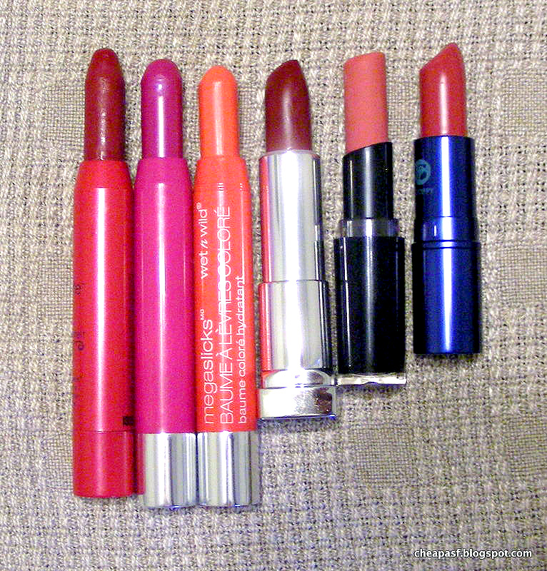
I actually ended up buying two things that no one suggested, but they worked out very well. The first is a Wet N Wild MegaSlicks Balm Stain Moisturizing Lip Color (insert obligatory complaint about the long name here) in Coral of the Story. I bought this without very high expectations, but I needed a new tube of my favorite Wet N Wild eyeshadow primer, after the two other primers I had left proved practically useless, and CVS had a BOGO sale on WNW. So I grabbed this bright coral-pink crayon, which otherwise would have cost $3.
This stuff is surprisingly great! It is indeed both moisturizing and a stain. It feels like a balm, is quite opaque, and yet isn't patchy or smeary like a lot of other corals. It's exactly the color I was looking for - a coral that's a bit closer to pink than orange or red. Victory on all counts. I can't really think of anything to complain about, and you know how much I like complaining.
Here it is on my lips. The color really brightens up my face. I forgot to take a full face shot, but I'll post one on Instagram soon and link it here. There's also an arm swatch later in the post, if you prefer that.
At the same time, I had my last round of Birchbox points to use up, and I decided to spend them on something weird and fun. I redeemed them for two things: an expensive lipstick that I will review soon, and Peripera Peri's Tint Water in Mandarin (#4, since I've seen multiple names for this shade out there). By buying this stuff, I was partially taking two suggestions I had been given when I wrote about my omgstruggles with coral before: to try mixing orange and pink lip products and to try Benefit Cha Cha Tint. Of course, the idea of mixing was to make do with things I already had, not to buy more shit, and Cha Cha Tint is already coral, not orange, so I pretty much violated the spirit of both suggestions. But they inspired me nonetheless.
I generally avoid buying beauty products on the basis of pretty packaging, and therefore I avoid photographing the packaging for the most part. But since I wanted this Tint Water anyway and I was photographing it anyway and it happens to be adorable in the typical Korean beauty fashion anyway . . . please enjoy this packaging photo:
My original quest for a wearable, affordable, bright coral lip-something failed, and I was ready to admit defeat, though I had made some interesting discoveries along the way. Then I got so many helpful recommendations that I felt compelled to give it another go. In the end, I kind of (sort of) took a couple of the suggestions I got, and I am pleased with my success. I've compiled all the recommendations I got in the comments of the post, on Instagram, and on Tumblr, at the bottom of this post for any others who undertake a similar journey. Thanks, everyone!
That sounds a bit dramatic when we're talking about lipstick, but whatever.
I actually ended up buying two things that no one suggested, but they worked out very well. The first is a Wet N Wild MegaSlicks Balm Stain Moisturizing Lip Color (insert obligatory complaint about the long name here) in Coral of the Story. I bought this without very high expectations, but I needed a new tube of my favorite Wet N Wild eyeshadow primer, after the two other primers I had left proved practically useless, and CVS had a BOGO sale on WNW. So I grabbed this bright coral-pink crayon, which otherwise would have cost $3.
![]() |
| Wet N Wild MegaSlicks Balm Stain in Coral of the Story |
Here it is on my lips. The color really brightens up my face. I forgot to take a full face shot, but I'll post one on Instagram soon and link it here. There's also an arm swatch later in the post, if you prefer that.
![]() |
| Lip swatch of Wet N Wild MegaSlicks Balm Stain in Coral of the Story |
I generally avoid buying beauty products on the basis of pretty packaging, and therefore I avoid photographing the packaging for the most part. But since I wanted this Tint Water anyway and I was photographing it anyway and it happens to be adorable in the typical Korean beauty fashion anyway . . . please enjoy this packaging photo:
![]() |
| Peripera Peri's Tint Water in Mandarin #4 |
Subscribe to:
Posts (Atom)