Showing posts with label eyeshadow palette. Show all posts

Monday, April 17, 2017

Swatch-o-rama: Laura Mercier Eye Art Artist's Palette Comparisons

Affiliate Links

Laura Mercier Eye Art Artist's Palette

I had the Laura Mercier Artists' Eyes Arty Art Eye Eye Art Artist's Palette on my Christmas list last year mainly because I loved Plum Smoke, which works as an easy, warm neutral on me (and is a pretty good dupe for the horrendous Maybelline Color Tattoo in Vintage Plum, reviewed here). The single is $25, while this whole palette is $55 ETA: Now half price at Nordstrom Rack. Since I'm not likely to get through any powder eyeshadow ever, and the other colors in this palette looked pretty too, I figured the palette was the better way to go (at least when I was imaginarily spending someone else's money).

My mother-in-law generously obliged--except she bought me the Eye Art Caviar Palette, an understandable mistake, since the names are not very descriptive or distinctive. Luckily I was able to exchange it without any problem, and so here I am with this dreamy, purpley palette that's unlike anything I already had (in contrast to the the bronzey Caviar palette). It's flattering and versatile for my coloring, and though I wouldn't say it's so amazing as to be worth a small fortune, it doesn't feel like it's exorbitantly overpriced for what you get. As you'll see from the swatches below, though, this isn't your trendy, super-pigmented eyeshadow palette. Most of the shadows, especially the light and medium shades, apply fairly sheerly, though they can be built up without trouble. I'd say that the most disappointing shade is African Violet, because it looks stunning the pan. It tends to stay on the sheer side on my eyelids, and the gold shimmer doesn't show up much. I haven't tried it over glitter primer yet, though, and it's possible that would help, like it has with other shimmery eyeshadows that don't contain actual glitter.

Here are some closer views of the pans:

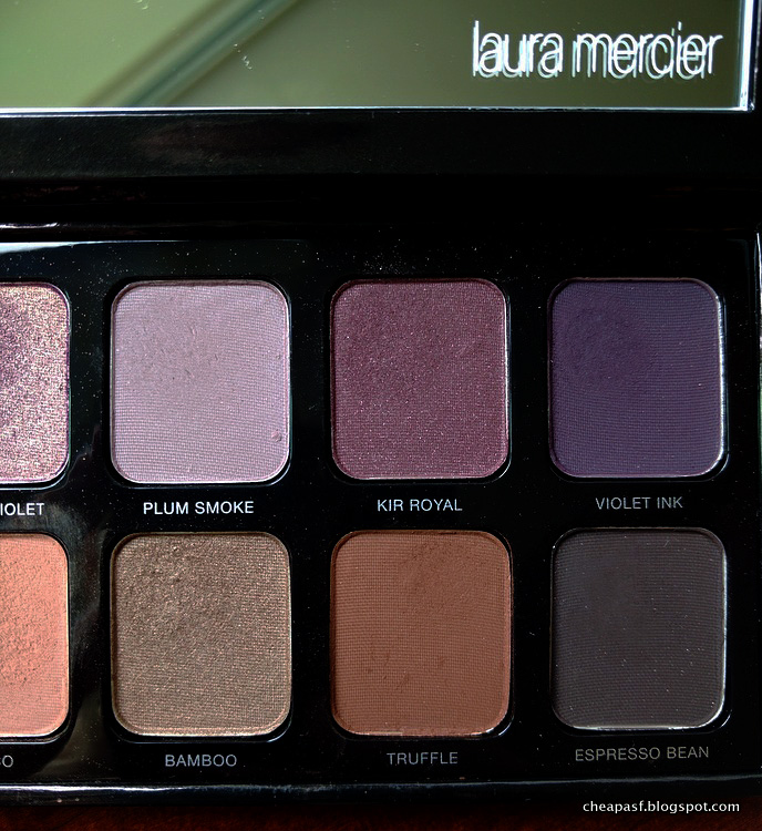
Laura Mercier Eye Art Artist's Palette

Laura Mercier Eye Art Artist's Palette

The main reason I decided to write a post about this palette is that I wanted to compare some of the shadows to others that I already had, particularly those in the Covergirl TruNaked Roses palette (reviewed here), so I'll share those swatches with you, along with some other comparisons. It turns out that I don't seem to have dupes for the more interesting colors here, which makes this palette a nice addition to my outrageous makeup hoard.

First, here are swatches of all the shadows in the Laura Mercier Eye Art Artist's Palette. All the swatches in this post were done over Wet N Wild primer (reviewed here), because I wanted everything to stick well enough that I could clearly compare colors.

Swatches of Laura Mercier Eye Art Artist's Palette: (1) Sparkling Dew, (2) Guava, (3), African Violet, (4) Plum Smoke, (5) Kir Royale, and (6) Violet Ink.

(1) Sparkling Dew, (2) Guava, (3), African Violet, (4) Plum Smoke, (5) Kir Royale, and (6) Violet Ink.

The top row contains most of the pinks and purples. The first three shades are a little sheer but, as I said, they can be built up, and Sparkling Dew and Guava seem invisible mainly because of how similar they are to my skin.

Swatches of Laura Mercier Eye Art Artist's Palette: (1) Vanilla Nuts, (2) Primrose, (3) Fresco, (4) Bamboo, (5) Truffle, and (6) Espresso Bean.

(1) Vanilla Nuts, (2) Primrose, (3) Fresco, (4) Bamboo, (5) Truffle, and (6) Espresso Bean.

The bottom row has the peaches and browns. Again, the peculiarly-named Vanilla Nuts is decently pigmented, but too close to my skin tone to show up well on my arm.

Below are some comparisons swatches I made. I only compared the shades that I thought were more interesting, which means I skipped the lightest two shadows (also because you wouldn't be able to see anything) and the darkest browns. I didn't find anything comparable to the two darkest purples (yay me), so they haven't been included either.

First up, the shimmery pinks/rose golds:

Swatches of (1) Laura Mercier Guava, (2) Laura Mercier Primrose, (3) Covergirl Roses Champagne, (4) Covergirl Roses Rose Gold, (5) Wet N Wild Silent Treatment Trio, (6) theBalm Cindy-Lou Manizer, (7)  e.l.f. Enchanted, and (7) Urban Decay Fireball.

(1) Laura Mercier Guava, (2) Laura Mercier Primrose, (3) Covergirl Roses Champagne, (4) Covergirl Roses Rose Gold, (5) Wet N Wild Silent Treatment Trio (browbone shade), (6) theBalm Cindy-Lou Manizer, (7)  e.l.f. Enchanted (reviewed here and here), and (7) Urban Decay Fireball.

No dupes for me!

Swatches of (1) Laura Mercier African Violet, and (2) purple from Paula's Choice Four Mattes and a Glam.

(1) Laura Mercier African Violet, and (2) purple from Paula's Choice Four Mattes and a Glam.

You can see here what African Violet looks like when it's built up a bit more. The Paula's Choice purple with gold shimmer looks almost pink in comparison, but it's definitely purple in its pan.

Swatches of (1) Laura Mercier Fresco, (2) medium warm brown from Juvia's Place Nubian Palette, and (3) Wet N Wild Comfort Zone palette (brown eyelid shade).

(1) Laura Mercier Fresco, (2) medium warm brown from Juvia's Place Nubian Palette, and (3) Wet N Wild Comfort Zone palette (brown eyelid shade).

Fresco is an awesome, unusual color. Depending on the lighting, it can look peachy or rosey, or taupey or clayish. I didn't have anything remotely like it.

Swatches of (1) Laura Mercier Plum Smoke, (2) Makeup Geek Fairytale, and (3) Covergirl Roses Copper Rose.

(1) Laura Mercier Plum Smoke, (2) Makeup Geek Fairytale (reviewed here), and (3) Covergirl Roses Copper Rose.

Plum Smoke, my favorite shadow from the palette, looks absolutely purple in the palette, but next to Fairytale, you can see where its name comes from. The warm taupe in it makes it both smokey and plummy. It's another unusual shade.

Swatches of (1) Laura Mercier Bamboo, (2) Maybelline Color Tattoo in Bad to the Bronze, (3) BareMinerals A-ha, and (4) Wet N Wild Nutty.

(1) Laura Mercier Bamboo, (2) Maybelline Color Tattoo in Bad to the Bronze (reviewed here), (3) BareMinerals A-ha, and (4) Wet N Wild Nutty.

Bamboo, unlike the others, is not unique. Bad to the Bronze looks a lot different in a swatch, but that's mainly because it's a cream that I applied with my finger. I find that all of these look very similar on my eyelids, though Bad to the Bronze can be intensified more easily. (The smearing is from Nutty, which is a bit messy, like most Wet N Wild shadows.)

This exercise was very useful for me in the end! Despite the repeated layers of primer all over my arms and the resulting dryness. It confirms that the Laura Mercier Eye Art Artist's Palette has, if not completely unique colors, a lot of shades that are unusual not duplicated in my unnecessarily large collection of eyeshadows. I've got a lot of use out of the palette already, and it's not something that I expect to get sick of in the future. The name is pretty stupid, though.

Friday, January 8, 2016

CoverGirl TruNaked Roses Eyeshadow Palette Review (with swatches)

Disclosure: Affiliate links.
CoverGirl TruNaked Roses Eyeshadow Palette Review

Day after day after day of overcast gloom is crushing my creativity, and I can't think of a jazzy title for this post. Don't mistake that for my being unenthusiastic about this eyeshadow palette. I've been having a lot of fun with it, and the quality is remarkable. I do recommend it.

There have been lots of drugstore nude palettes released in the last year or so in apparent competition with the mega-popularity of Urban Decay's Naked line and other higher end palettes. Most of them, from L'Oreal, Revlon, Maybelline, etc., have received pretty lackluster reviews, doing nothing to improve the reputation of drugstore eyeshadows, so I hadn't been at all interested in getting them. But then last month swatches of CoverGirl's new TruNaked palettes appeared on a few blogs, and they looked much more promising. They each have 8 pans and there are three varieties: Goldens, Nudes, and Roses, corresponding to Naked 1, 2, and 3, it seems. The comparison with Urban Decay is made pretty explicit by the marketing for these CG palettes, including the sticked on the front that reads: "shades like a leading $50 eye shadow palette." UD Naked palettes are usually $54, but close enough. It turns out that these eyeshadows really are quite comparable to the UD eyeshadows I've used--for better or for worse.

I was most tempted by the Roses palette, in part because I have been curious about Naked 3 since it came out, but not enough to spend that much money on it. Pinks and reds, and even reddish-purples, in eyeshadows tend to look dreadful on me, despite all the usual tricks like separating them from my eyes with thick black liner and so forth. $12 feels like a much more reasonable gamble than $54. The Goldens palette was also stunning under the drugstore lights, but I'm pretty sure I have dupes for all of its shades. Roses was the most appealing. Look:

CoverGirl TruNaked Roses Eyeshadow Palette Review

Here it is in direct sunlight to show off the sparkle:

CoverGirl TruNaked Roses Eyeshadow Palette Review

The back of the palette has names for all of the shades, which are, left to right: Almond, Champagne, Baby, Rose Gold, Copper Rose, Dusk, Mauvergine, and Mousse. The matte shades are Almond, Baby, and Copper Rose, though they are more of a satin matte than completely flat. In the pan, Champagne, Rose Gold, and Mousse have the most sparkle--in use, however, all four of the darkest shades look mostly matte. You can see what I mean in my swatches on bare skin (no primer):

CoverGirl TruNaked Roses Eyeshadow Palette swatches

I think that most of the swatches I've seen elsewhere must have been done with a finger rather than with a brush, like I used here. With a finger they would be smoother and more opaque, but they are still nicely pigmented no matter what. There is none of the patchiness that appears in these swatches when I use them on my eyelids. (Almond is invisible only because it's the same color as my skin.)

CoverGirl TruNaked Roses Eyeshadow Palette swatches

CoverGirl TruNaked Roses Eyeshadow Palette swatches

You can see that the darker shades in particular are a bit crumbly and messy. That's what I meant about these being similar to UD for better for for worse. I've had a number of UD shadows, both a number of singles and the Dangerous Palette (reviewed here), and my main complaint is that they are excessively pigmented and messy. They have a lot of fallout. More pigmentation is usually considered a good thing in eyeshadow, but it does mean you have to be careful, especially if you have limited eyelid space for blending like I do. You have to use an extremely light touch and blow excess off your brush, etc. I actually didn't have nearly as much of a problem with fallout with these CG shadows as I've had with UD, but they are very soft and crumbly in the pan. For that reason, and because this type of clear plastic packaging is prone to cracking in my experience, this palette probably wouldn't be the best choice for travel.

I originally planned to include photos of all the looks I've created using this CG palette--and I've done a lot, because it's really fun to play with--but it soon became obvious that this long stretch of overcast days combined with my shitty camera doesn't make for attractive or useful photos of that sort. But I will show you an outtake to illustrate what I described above.


This photo was taken the first time I experimented with the palette, before I'd really got the hang of it. It shows the downside of impressive pigmentation, I think. See that stupid-looking line of dark brown shadow across my crease? My usual technique is to use a slightly pointed brush to draw a sort of line along the crease and then to use a bigger, rounded brush to blend. That doesn't work very well with this stuff, especially if you use primer. This photo shows the result after a ton of fucking blending. It was not going anywhere. I recommend using a very small amount, adding more only if you need it, and using a fluffy, not dense, brush to apply it. The Real Techniques Base Shadow brush (part of the Starter Kit), which has a sort of duo fiber thing going on, works well. If you don't need to use primer to prevent creasing and fading like I do, then you might just as well go without. These shadows don't need any assistance in the pigmentation department.

Here are the swatches in direct sunlight, again to show that when you actually apply these shadows, it's really only Champagne and Rose Gold that are particularly shimmery.

CoverGirl TruNaked Roses Eyeshadow Palette swatches

Most of these shadows, even those that look very pink in the pan or in swatches, come off as more mauve or brownish with a purple tinge on me, which makes them very wearable. I was really pleasantly surprised by how much I love the colors. You can use them to create some stunning, not-too-sickly, gothic romance heroine looks.

I had a $5 CVS coupon that I used on this palette, so I got it for $8 and some change, which I think is very reasonable. The only place I've seen it online so far is at ULTA, where it's priced at $12, which is cheaper than CVS at full price. They also have a BOGO 50% off sale of all CoverGirl right now, so if you need something else (a second palette??), you can get an even better deal.

ETA: You can now get this palette for just $10 at Target. Much better!

Because sometimes I can be fooled by an overall lower price, I was curious how this palette compared per ounce to the value of Urban Decay Naked 3. Naked 3 is $54 for 0.6 oz. of product, which makes it $90 per ounce. CoverGirl Roses is 0.23 oz. for (about) $12, which makes it $52 per oz. Significantly cheaper! Phew. (With UD you're paying more for sturdier packaging, blah blah.)

All in all, this is an unusually impressive eyeshadow palette from the drugstore and well worth the price. It is on par with Urban Decay and as good as just about any other more expensive eyeshadow I've tried. Highly recommended--just use a soft touch!
Related Posts Plugin for WordPress, Blogger...